Lara Mah Jong
A brand system that makes American Mah Jong approachable and empowering
00
problem
American Mah Jong can feel intimidating, and the brand needed to connect with women in a way that felt modern, welcoming, and confidence-building. With multiple communities, members, teachers, and challenges, users risked confusion without a clear, cohesive structure.
solution
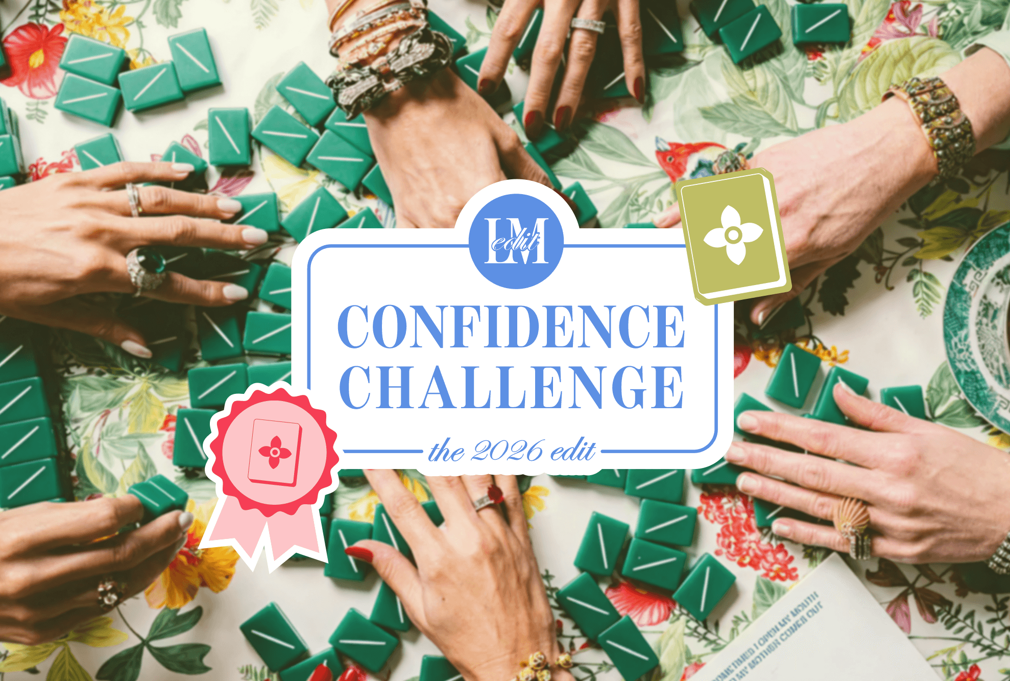
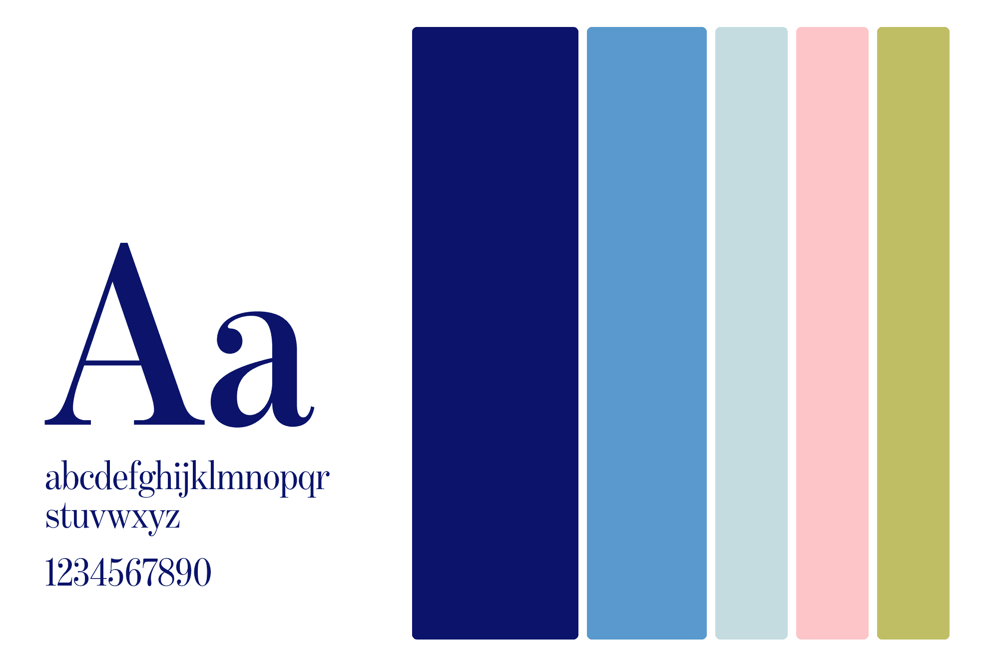
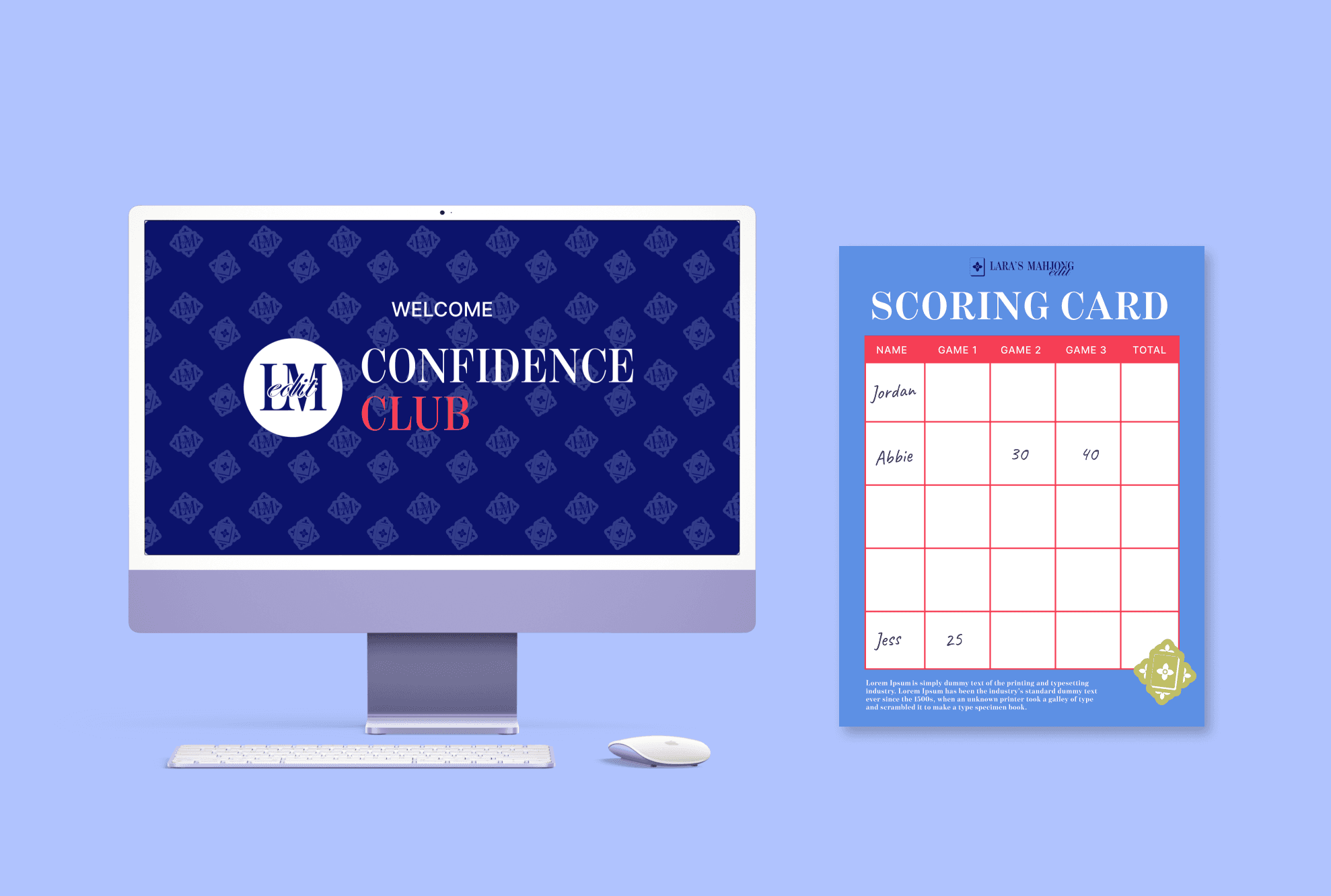
We designed a flexible brand universe that organizes all three sub-brands under a unified visual system. Each sub-brand has its own tone and purpose while sharing core typography and design DNA, making it instantly recognizable. This approach ensures consistency across touchpoints while allowing each community to shine in its own way.
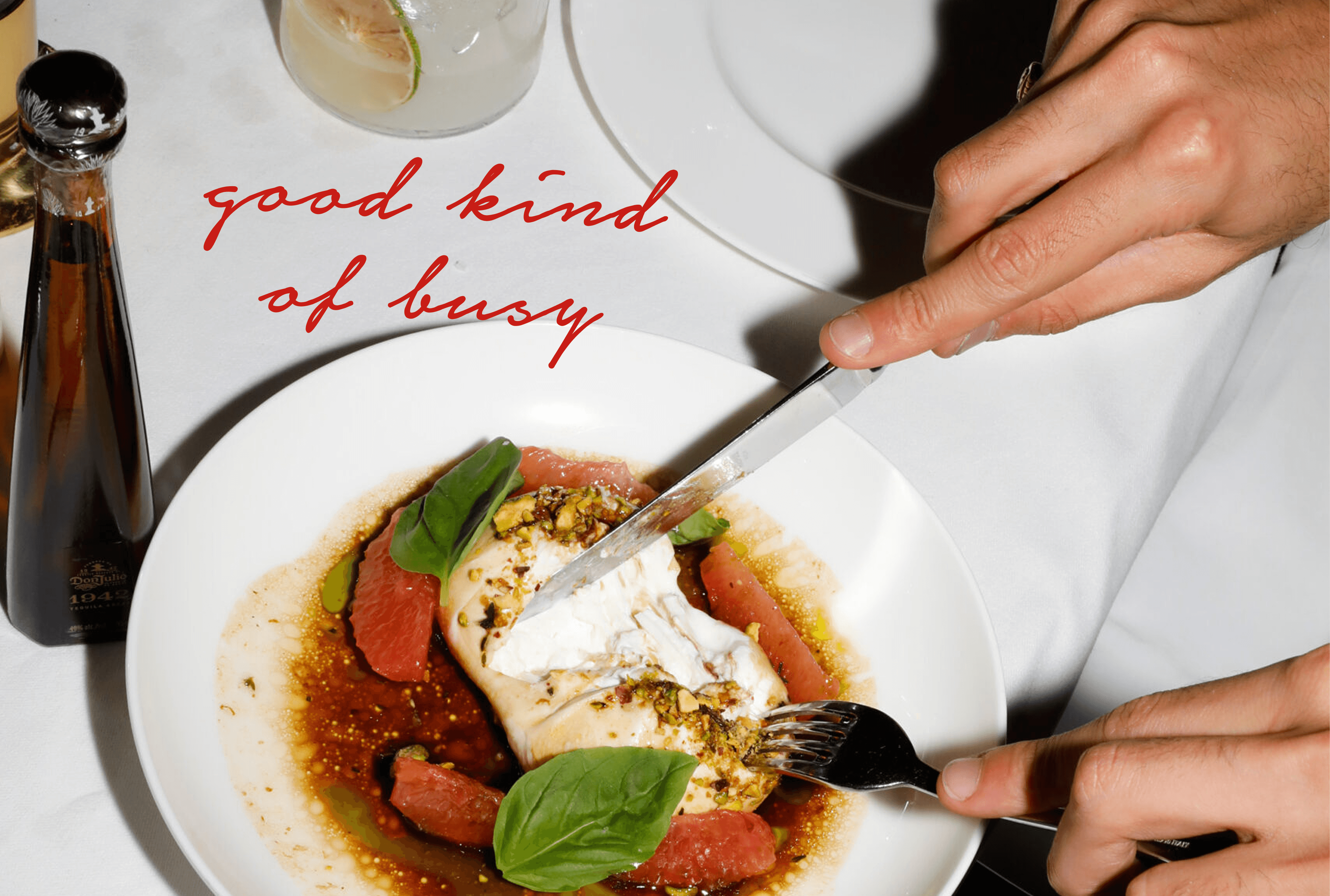
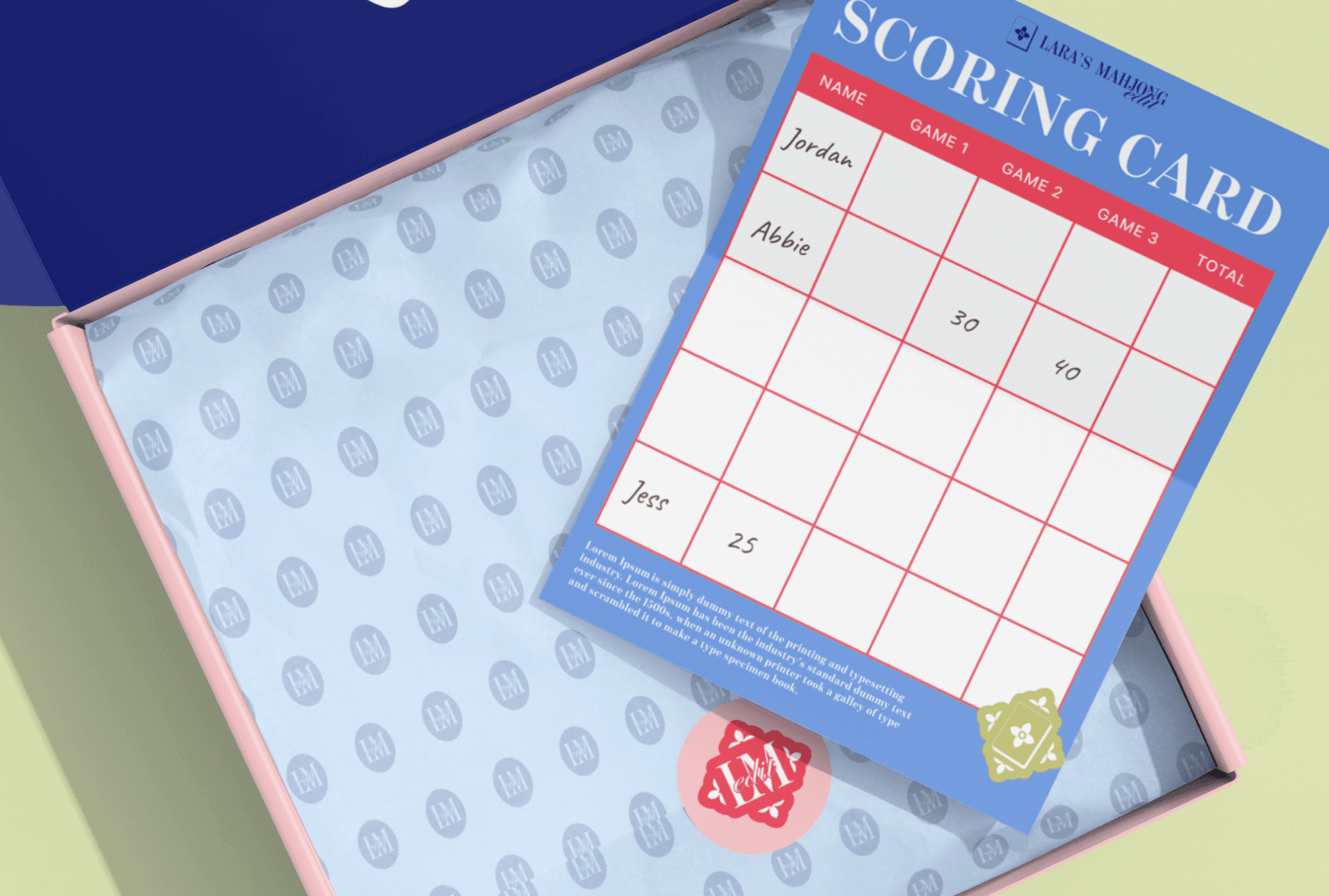
Lara’s Mahjong Edit empowers women to enjoy the game while building strategy, confidence, and connections.
Our design intervention created a scalable, cohesive system that supports growth, keeps the experience clear and engaging, and celebrates the joy of the game through thoughtful, flexible visuals.
year
2025
timeframe
2 months
tools
Figma and Adobe Illustrator
category
Branding and Identity
01
02
03
04
05

see also